
About this series: Starting from 2021, I wanted to read a bit more of on web development with the goal of improving my english and web developing skills. In order to keep this knowledge, I thought it would be a good exercise to summarize this stuff in blog posts
What does it do?
Modern websites are using diagonal elements a lot more, than in the past. One of the ways to achieve this, is to use the clip-path property in css.
clip-path actually allows you to hide certain parts of SVGs or any other elements, so that they will have a certain form like a triangle, a circle or a pentagon.
clip-path: circle
As the the name already suggests, the circle() value, allows to create a circular clipped form:
clip-path: circle(30% at 50% 50%);
Where the first value would determine the size of the circle or the radius in other terms. the two values after “at” would specify the center of the circle
clip-path: polygon
The polygon() values just consist of all the points used in the polygon, and each of them is specified as “X% Y%” (obviously Pixel values can also be used, but I tend to always use relative values if possible).
So for an pentagon this would look like this:
clip-path: polygon(20% 0%, 80% 0%, 100% 100%, 0% 100%);Browser Support
At the time of the publish date of this blog (01-2021), according to the MDN Webdocs the clip-path feature on HTML elements was supported on all browsers, except Internet Explorer:
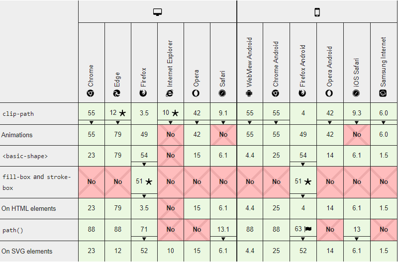
Although using clip-path on SVG would be available there too
Additional Resources
The must go resource in term of clip-path for me is the clip-path maker over at bennettfeely.com: https://bennettfeely.com/clippy/